POST-UP
“Find a place to work, wherever you are”
5-DAY SOLO DESIGN SPRINT
ROLE: LEAD DESIGNER
What is Post-Up?
“Post-Up is a new startup where freelancers and remote workers sharet tips and advice”.
Problem Statement
PostUp is offering a feature to its users that will easily connect workers to good public workspaces.
PostUp wants to help users find public spaces that already exist
Wants to charge a monthly fee to users in exchange for access to PostUp information, so giving the best information is needed
The solution must be designed for the mobile app
Design Constraints
For this design sprint, I was the main UI and UX designer with guidance from my Springboard mentors. The design prompt was from BitesizeUx.com. Throughout this case study, I will also showcase :
Synthesizing research
Ideating solutions
Wireframing and Storyboarding
High fidelity Prototypes
Usability Testing.
My Role
Project Timeline
Quiet Workspaces
Space to do calls
Where quick meetings can take place
Wifi or Free Wifi
Bathrooms
DAY ONE
Outlets
Food and Coffee
Easy to Walk to
Places that are not too crowded
Places that are workers friendly
enough tables and chairs
Below are some key factors in experience I collected that influence users' decisions on which workspaces to choose:
Research
User Persona
How might we help users see the public spaces’ foot traffic?
How might we make it efficient for remote workers to find public work spaces?
How Might We
How might we help users find the best workspaces for them?
How might we helps users see what kind of amenities a space has?
End-to-End User Map
DAY TWO
For my lightning demo, I utilized apps like Yelp, Google, Airbnb, and Harvest Hosts to cross reference how each platform utilized their UI to display amenities, maps, and different locations to their users.
Lightning Demo
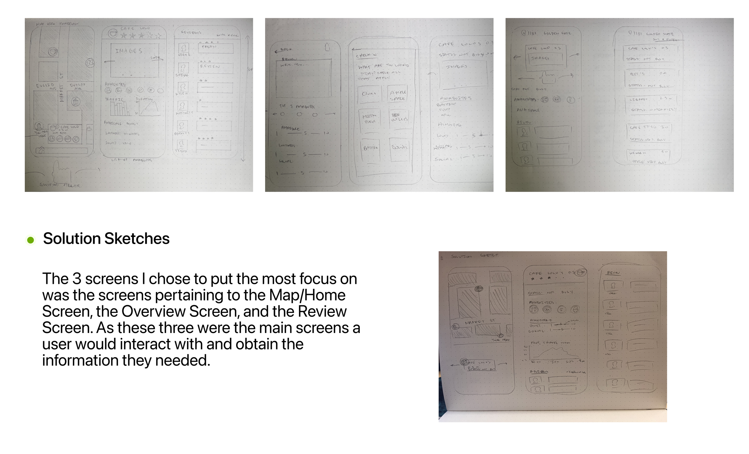
Crazy 8 Sketches
DAY THREE
Storyboard
DAY FOUR
Paperprototype
DAY FIVE
During this test, I gathered 5 people and tasked them to find the a space with a bathroom and wifi. And also go through the app overall, and ask about any confusing parts.
What I find was:
3/5 Users brought up the cleanliness of the facility when looking for the bathroom.
2/5 Users asked about beyond ‘Social’ and ‘Quiet’ pertaining to ambiance, if there will be a tab pertaining to music levels.
4/5 Users asked what the plus sign next to the amenities were, under the “Leave a Review Screen”
1/5 User brought up that there should be an add “others” to the amenities
Testing and Findings
The possible solutions I came up with were:
Adding “cleanliness” and “music” sections under the ‘Ambiance” in the overall review screen
Create a clearer indication of how to add the amenities users have seen
Add the “others” portion to the amenities
Possible Solutions
Hi-Fi Screens
FINAL THOUGHTS
Work on the Map Screen and color code different location pins
Add sliders to the ‘Rate Ambiance’ section of the “Leave a Review Screen”
Create “View More Reviews”
Add the “Monthly Payment” Screen
Next Steps
Throughout this Design Sprint, I learned so much and I thoroughly enjoyed the whole process of going through these 5 days. One aspect I really enjoyed was the first few days, I really pushed hours of work to get as many ideas across as I could. The experience really pushed me to think as many ideas as possible.
I think the most important lesson I learned was in the beginning as opposed to scheduling an interview day with 5 people, that I should have scheduled a few more back-ups. The day interviews and testing were supposed to happen, a few people had other obligations to fill which left me looking for others last minute.
Overall, I had an amazing experience and would love to see what is more to come for design sprints!


